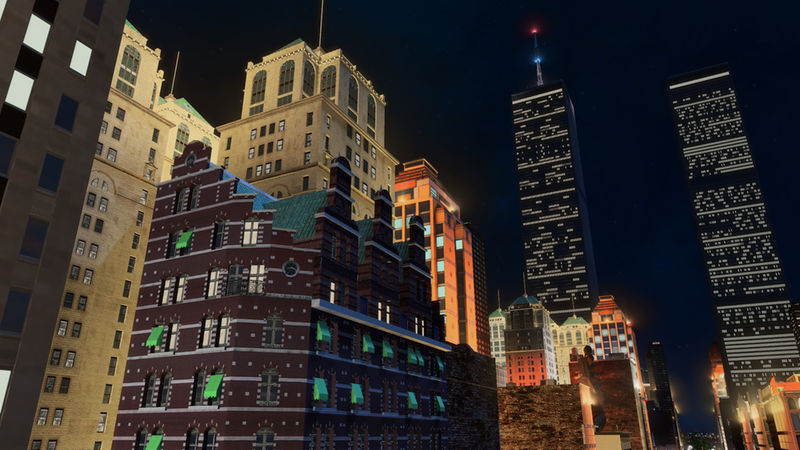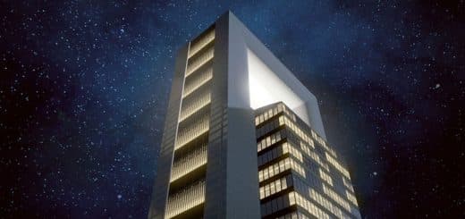
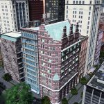

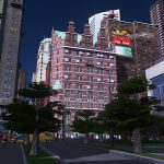
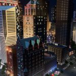
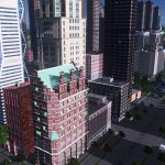
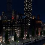
Freitagh building (2×4 growable office corner)
Please leave a vote if you download! This is a 2×4 office lvl 3 building based on the The John Wolfe building. The Freitagh building in Sim City was inspired by the real life John Wolfe building. You will need a lvl 1 and 2 of the same size in your building theme.
About the model
This is a brick building, with a metal frame. The architect was inspired by Old Dutch and Belgian architecture. The corner was particularly difficult to model. Also took me quite a while to get this one on the workshop due to taking a break. I already finished the model and texture quite a while ago. Conceived the LoD with it’s texture last week.
This model has about 6700 tris and a 2048×1024 texture, with a diffuse, shadow, color, normal, illumination and specularmap.This model has a custom LoD, which is about 600 tris with a 512×256 texture, with a diffuse, specular, color, normal and illumination map.
About the building
The Wolfe Building was put up by the estate of John Wolfe, one of the great hardware merchants of New York. The architect, Henry J. Hardenbergh, was often trusted by estates and family building operations, like that of the Rhinelanders.
Hardenbergh’s 12-story building was a tour de force of early skyscraper design, in rich red brick trimmed with light-colored stone and terra cotta in patterns of the Flemish and Dutch Renaissance.
Tall building design was an emerging and controversial field, and in 1896 the critic Montgomery Schuyler said Hardenbergh’s design proved that the skyscraper was “artistically tractable.” He praised the skyline of the Wolfe Building, particularly the angled facade on Maiden Lane, which gradually diminished, through complicated angles and recessions, into a spectacular gable perhaps 200 feet above the street.
The Wolfe Building was soon hard to see, hemmed in by other structures, but the insurance building went up at the pointy end of the block, its angled bow giving it a shiplike presence, slicing through the chop of the older buildings. Frederick Hill, the architect, discussed it in the journal Architecture in 1908, noting “the omission of any form of cornice and the use of penetrated vaulting in its place,” referring to the polychrome terra-cotta elements at the top.
Hill remarked that with the new crop of high buildings, the idea of making a traditional cornice, with intricate architectural patterns, “appears to us entirely wrong” and indeed “part of the problem over which we are all working.” Architects were rethinking almost every element of design as buildings got higher and higher. The new “A.I.A. Guide to New York City,” by Norval White, Elliot Willensky and Fran Leadon, calls the insurance building “magnificently corniced, wonderfully proportioned.”
Both were demolished in the mid-1970s by Our Fair City to widen the streets and improve traffic flow to the new World Trade Center. Kent Barwick and Brendan Gill, both of the Municipal Art Society, protested, Mr. Barwick calling demolition “needless” in The New York Times in 1974.
Although obvious candidates for landmark designation today, at the time such second-tier commercial buildings were considered interesting but not designation-worthy. Thus traffic won out, and the leftover land has for years been a favorite lunch spot, Louise Nevelson Plaza. The plaza does open up the view to the palazzolike 1924 Federal Reserve Bank, at the William Street end of the block, although that is scant consolation.

